QML Application Structuring Approaches
| This article may require cleanup to meet the Qt Wiki's quality standards. Reason: Needs to be updated to QtQuick 2 Please improve this article if you can. Remove the {{cleanup}} tag and add this page to Updated pages list after it's clean. |
En Ar Bg De El Es Fa Fi Fr Hi Hu It Ja Kn Ko Ms Nl Pl Pt Ru Sq Th Tr Uk Zh
Introduction
A common approach to deal with a complex application is to decompose it in several smaller units. This leads to better structuring of application and more productive development process as a whole. QML offers two constructs that service this approach – Component and Loader elements. Roughly speaking, the both elements bring similar functionality. But the ways they do this are different. We may refer to the Component approach as static one and the Loader approach as dynamic one. We first re-call Component and Loader definitions, then compare the two approaches and in the main part of this article describe several Loader element use cases. There are two other approaches to structure a QML application – dynamic creation of objects and module importing. They are beyond the scope of this article.
Component Element Definition
A QML component is a separate, autonomous unit that contains other QML elements. It could be defined in two modes – as an inline unit in a QML file or as a separate QML file. The main point with QML component is that it could be reused many times through its very convenient interface. For more details about Component syntax and interface consult the documentation.
How does the Component element support application code structuring and particularly its decomposition? In case of component file it is obvious – the application is split in several components. They are included in the main file and instantiated via their interfaces, for example like this:
QML File
...
Banner {           // The component file Banner.qml, located in the directory of the
                   //QML File is instantiated here
  id: ban1
  color: "red"
}

AnotherComponent { //Here another component is instantiated
  ...
}

Banner {           // Here we use the same component file Banner.qml. The instantiated component is
                   // different from ban1 – different id,
  id: ban2         // property color has different value, etc.
  color: "lightblue"
}
Including of the component means that we get an instance of the component viewed as a template. The basic component is used to generate instances only and these instances do not depend anymore on the basic component. We may have several instances and they behave independently, treated like basic QML elements. Note that Component interface allows to re-define component properties - predefined ones as well as defining new ones. This is the case of the color property in the snippet above. We could even just instantiate the component and not alter any property.
...
Banner {}
...
We may have many instances of Banner component provided that they have different id.
By now we are considering properties defined at the top level of the component file. What about siblings’/children’ properties in a component file? Let us consider the following case:
ExampleOne.qml - Component file
// This component file is used in componentScope.qml file
// The point is how to have access to color property out of the scope of Text element

import QtQuick 1.1

Rectangle {
  width: 300
  height: 200
  property alias nameTextTop: nameText // This alias is defined at top level and bound to Text element

  Text {
    id: nameText
    color: "blue"
    text: "Some text fragment"
  }
}
componentScope.qml – It is using component ExampleOne
// The component ExampleOne is instantiated and its color property is change to red
import QtQuick 1.1

Rectangle {
  width: 360
  height: 360
  ExampleOne {
    id: instance
    nameTextTop.color: "red"
  }
}
As you see, if we want to re-define the property color of nameText child we have to make it visible at the top level. To get this we define an alias of the nameText at the top level. This alias is re-defined in componentScope.qml file.
Could we develop more complex structures with components? For instance, could we have nested components? By nested components we mean that a component contains another component. Structures like these are acceptable:
nestedComponents.qml - Main file
// Main file uses a component – Comp1. It in turn applies a nested component Comp2.
import QtQuick 1.0

Rectangle {
  width: 360
  height: 360

  Comp1 {} // This component has a nested component Comp2
  Text {
    anchors.centerIn: parent
    text: "Top Level - we use a component Comp1"
  }
}
Comp1.qml - First level component file
import QtQuick 1.0

//First level component Comp1.qml
Rectangle {
  width: 100
  height: 62
  color: "red"

  Comp2{} // This component becomes part of Comp1
}
Comp2.qml - Second level component file
import QtQuick 1.0

//This is a component we nest in another component Comp1
Rectangle {
  x: 50; y: 40
  width: 100
  height: 62
  color: "green"
}
The inline definition syntax of the component element is very similar to this one of other QML elements. It starts with a key word Component followed by element block (represented by { } pair). Within the block you may define and nest other QML elements – refer documentation.
On the other hand, inline Component offers other kind of structuring. It encapsulates a piece of QML code that could be assigned as a property value of other QML elements. Particularly this mechanism is used in the definition of the Loader element – see the next section. This kind of structuring is sometimes referred as aggregation. An example how inline Component could be utilized is demonstrated in section Loader and Inline Component.
Loader Element Definition
Loader element serves as a handler, which loads dynamically a QML unit formed as a separate QML file or inline component. Dynamically means that the QML unit to be loaded is determined at run-time, for example if a mouse button is clicked. The loaded unit is described as value of source or sourceComponent property of the Loader. The source value is a URL value – the path to QML file to be loaded. The sourceComponent value is id name of an inline component. Where can we bind values to these properties? The rule is: at places where the Loader id name is visible. In the following sections you see many examples of implementation of this rule. For more information on Loader see documentation.
One interesting point is how the loaded QML unit could be accessed. The Loader element has a default property item. It is read-only and has Item type. In other words, loaded QML unit is a QML Item element. We recall that it is not visible and serves to group other QML elements. An illustrating snippet on item property follows:
LoaderItem.qml
// QML file Page.qml is loaded by Loader top. Its color property is red
// Using Loader item property the color property is changed to blue
import QtQuick 1.1

Rectangle {
  width: 360
  height: 360

  Loader { id: top }

  Rectangle {
    Component.onCompleted: {
      top.source = "Page.qml"
    }
  }

  Text {
    anchors.centerIn: parent
    text: "Hello World"

    MouseArea {
      anchors.fill: parent
      onClicked: {
        top.item.color="blue"
      }
    }
  }
}
Page.qml
import QtQuick 1.1

Rectangle {
  width: 100
  height: 62
  color: "red"
}
We could set up source or sourceComponent properties in the Loader definition. Now the Loader element is processed like any other QML element and its target will be rendered. In this case the behavior is similar to the one of component element. But note that we may change programmatically properties values of source or sourceComponent at a later time.
Component Element vs. Loader Element
Now we are going to compare component file and Loader element. They both offer similar functionality, but differ in ways they are applied.
In case of a component file we have the following process. We declare the component (rather its interface) in a fixed way in the main file for example. QML parser immediately checks if a component file with the name as in component declaration exists. The parser searches in the directory where is placed the file.
The Loader acts a bit differently. When a QML file containing a Loader element is parsed, the Loader constructs itself like any other QML element. The Loader could define the source destination of the file to be loaded or not. In the first case the file is loaded. In the second case this is postponed to the moment we define the source destination of the file in a script element for example. Note that in case of source property we may point to a file located anywhere on our local computer or on the Internet. If we have many QML entities that are not needed permanently, there is no need to keep them in memory – rather load them as they are necessary. This leads to a better structuring of the application and more efficient computer memory management. Be aware that any consequent activation of a Loader destroys the previously loaded items. If we set an empty string as source property value or undefined value to sourceComponent property, the memory used by the Loader is released.
Because the file to be loaded by a Loader could be determined in run-time, the Loader approach is referred to as dynamic one. The component approach is called static one.
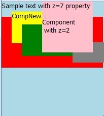
Combining loaders, components and other QML elements it is important to understand the hierarchy of elements and how they overlap each other. Let us create a demo example, which will illustrate QML elements rendering hierarchy. We are considering a QML main file that has two Loaders, one component and other standard QML elements. We re-define the z property of elements to control their overlapping.
elementHierarchy.qml – main file
import QtQuick 1.1

Rectangle {
  id: first
  width: 360
  height: 360
  color: "lightblue"

  Loader {
    id: newLoad
  }

  Text {
    id: textInner
    z: 3
    text: "Sample text with z=7 property "
  }

  Rectangle {
    id: second
    width: 100
    height: 100
    z: 2
    x: 80
    color: "pink"
    Text {
      text: "with z=2"
    }
  }

  CompNew {
    id: far
    x: 20
    y: 20
  }

  Loader {
    id: loadSecond
    source: "secondComp.qml"
  }

  Rectangle {
    id: dummy
    width: 80
    height: 40
    x: 140
    y: 80
    color: "gray"

    Component.onCompleted: {
      newLoad.source = "firstLoader.qml"
    }
  }
}
firstLoader.qml – file loaded by newLoad Loader
import QtQuick 1.0

Rectangle {
  width: 200
  height: 100
  y:30
  color:"red"
}
secondComp.qml - loaded by loadSecond Loader
import QtQuick 1.0

Rectangle {
  width: 100
  height: 62
  x: 40
  y: 45
  color: "green"
}
CompNew.qml – component file
import QtQuick 1.1

Rectangle {
  id:comp
  width: 62
  height: 62
  color: "yellow"
  Text {
    text: "CompNew"
  }
}
The next picture illustrates how QML elements are displayed and overlapping. As a rule elements are rendered in the order they are defined in the main file. In the snippets above z property is changed for text element textInner (z=3) and for rectangle element second (z=2) and they are rendered at the top element hierarchy.
You may experiment changing z property.
Loader Element Use Cases
Simple Wizard Template
Our application consists of several pages (3 in the snippet below), each of them formatted as a separate QML file. These files could be located in different directories, but for simplicity, we suppose they reside in the directory where our main file is located. Each page has its own Loader element and when a Click me button is pressed the Loader loads a next wizard page.
wizardSimple.qml – main file
import QtQuick 1.1

Rectangle {
  id: top
  width: 360
  height: 360

  Loader {                         // Declaration of a Loader. It will be activated later.
    id: main
  }

  Text {
    text: "Main file"
  }

  Button {
    id: buttonMain
    anchors.bottom: top.bottom    // Position the button in top rectangle
    anchors.right: top.right

    MouseArea {
      anchors.fill: parent
      onClicked: {
        main.source = "Page1.qml"; // Load a new page
        buttonMain.z = –1;         // Hide button
      }
    }
  }
}
Page1.qml – first wizard page
import QtQuick 1.1

Rectangle {
  id: page1Container
  width: 200
  height: 300
  x: 40
  y: 40
  color: "pink"

  Loader {
    id: page1                      // Declaration of a new Loader element
  }

  Text {
    text: "First page loaded"
  }

  Button {
    id: buttonPage1
    anchors.bottom: page1Container.bottom  // Position the button in page1Container rectangle
    anchors.right: page1Container.right

    MouseArea {
      anchors.fill: parent
      onClicked: {
        page1.source = "Page2.qml";
        buttonPage1.z = –1;        // Hide button
      }
    }
  }
}
Page2.qml – second wizard page
import QtQuick 1.1

Rectangle {
  id: page2Container
  width: 200
  height: 200
  x: 80
  y: 80
  color: "yellow"

  Loader {
    id: page2
  }

  Text {
    text: "Second page loaded"
  }

  Button {
    id: buttonPage2
    anchors.bottom: page2Container.bottom
    anchors.right: page2Container.right

    MouseArea {
      anchors.fill: parent
      onClicked: {
        page2.source = "Page3.qml";
        buttonPage2.z = -1;
      }
    }
  }
}
Page3.qml – last wizard page
import QtQuick 1.1

Rectangle {
  width: 120
  height: 62
  x: 100
  y: 100
  color: "green"

  Text {
    text: "Last Loaded Page"
  }
}
The above wizard implementation is very simple, but suffers of some drawbacks:
- When a new page is loaded the previously loaded page stays unnecessary into memory.
- We use similar loaders for each page – their IDs are different only.
- The order of pages loading is fixed one – the source property values are set in advance.
- There is no mechanism for exchange of information between the caller and the called page and vise-verse.
Now we will try to release the restrictions of the loading scheme from the previous section. Firstly, following the Simon Judge idea, we will apply a common Loader for all pages. Secondly, we suppose that the next page to be loaded is not known in advance – it is determined after a condition is evaluated. And finally, we will use signals to pass information between pages and demonstrate how multi-window screens could be constructed.
A common approach to trigger some actions after an event is fired is to define an own signal like that (for more information here):
signal MySignal(string message, int trigger)
where signal is QML keyword, MySignal is the name of newly defined signal, message is a parameter of type string and trigger is another parameter. The parameters could be of different QML types. For our purposes we want to pass a string that is the name of wizard page to be loaded and an index to identify the application state.
The main idea is as follows:
- When we want to load a page we emit our own signal.
- This signal is caught by a Loader defined somewhere.
- Our signal has a parameter to which we bound the name of the page to be loaded – as an URL value.
Use Case: We will consider an application that consists of a main page (Page1) and two other pages (Page2, Page3). The pages should be loaded sequentially and construct a wizard this way. Some of pages could be loaded checking for a logical condition creating the wizard branches.
Objectives: To demonstrate how a flexible wizard could be implemented based on QML Loader element. Additionally we may complicate the wizard constructing some multi-windows screens.
Design: Pages are loaded one by one. The application starts loading automatically Page1. To load the next page we should click the left mouse button. For Page1 we have two wizard branches depending on a logical value. We introduce a current index for pages (an integer) around which the application logic is build.
Development: For each page we define the same own signal:
signal handlerLoader(string name, int index)
To activate this signal (emit the signal) we have to invoke it as a method in a script block. A MouseArea onClicked script block is used. In invocation the name of the page to be loaded is passed as parameter. Emitted signal is attached (automatically) to the signal handler onHandlerLoader, which in turn is connected to a target pageLoader.item. The connection is carried out by a QML Connections element in the QML file flexibleLoader.qml. The target pageLoader.item is in fact the object loaded by the Loader (id:pageLoader) defined in the file flexibleLoader.qml. Note that the target property of the Connections element is of type Object. When Page2 is loaded we want a second window (NewWindow.qml) to be loaded into the same screen. This is done by a second Loader (id:window), which is defined in the file flexibleLoader.qml. The decision to load this second window is taken in onHandlerLoader block on the base of returned value of trigger parameter. Note that the Loader destroys previously loaded entities when loading new items.
Code:
flexibleLoader.qml – application main file
import QtQuick 1.1

Item {
  id: top
  width: 300
  height: 200

  Loader{
    id:window
  }

  signal handlerLoader(string name, int index)

  Loader {
    id: pageLoader
    source: "Page1.qml"
  }

  Connections {
    target: pageLoader.item
    onHandlerLoader: {
      pageLoader.source=name;
      if (index === 2) {
        window.source = "NewWindow.qml";
      }
    }
  }
}
Page1.qml – page 1
import QtQuick 1.1

Rectangle {
  id: test1
  width: 100
  height: 62
  color: "red"

  // switchPage1 value is logically controlled somewhere in the code
  property bool switchPage1: true
  property int page1Index: 2

  signal handlerLoader(string name, int index)

  MouseArea {
    anchors.fill: parent
    onClicked: {
      if (switchPage1) {
        handlerLoader("Page2.qml", page1Index);
      } else {
        handlerLoader("Help.qml", 0);
      }
    }
  }
}
Files Page2.qml and Page3.qml are similar to Page1.qml.
Download Package: Necessary files: flexibleLoader.qml, Page1.qml, Page2.qml, Page3.qml, Help.qml, NewWindow.qml. Get them from here.
Loader and Component Together
Use Case: Assume the page we are loading uses an external component (component file) and from this component we want to load a next page. What is new in this use case comparing with the previous one? The call to the Loader is not located at the top level now. It is nested in a component. When the Loader is defined in the main application the pages are loaded in its context. This requires the Loader source property to be determined at the top level also. To solve this problem we use cascading definitions of properties. Firstly, have a look at a diagram illustrating the use case:
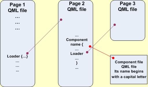
Design: It follows the diagram above. The main file componentLoader.qml loads Page1.qml, which in turn loads Page2.qml. The Page2.qml file instantiates a component – Inserted.qml. From within Inserted.qml the Loader in componentLoader.qml is invoked.
Development: The issue here is that the signal handlerLoader has to be activated at the top level of the file Page2.qml. When instantiating component Inserted we define an alias to the top level id: property alias next1:pop. The signal is invoked in Inserted.qml through a qualified name- next1.handlerLoader("Page3.qml",0).
Code: Main file componentLoader.qml and files Page1.qml and Page3.qml are similar to these ones of the previous section.
Page2.qml – this file instantiates component file Insert.qml
import QtQuick 1.1

Rectangle {
  id: pop
  width: 100
  height: 62
  x: 30
  color: "yellow"

  property int page2Index: 3

  signal handlerLoader(string name, int index)

  Inserted {
    id: comp1
    property alias next1: pop
    y: 20
  }
}
Inserted.qml – this is component file
import QtQuick 1.1

Rectangle {
  width: 100
  height: 62
  color: "blue"

  MouseArea {
    anchors.fill: parent
    onClicked: {
      next1.handlerLoader("Page3.qml", 0)
    }
  }
}
Download Package: Necessary files: componentLoader.qml, Page1.qml, Page2.qml, Page3.qml, Inserted.qml. Get them from here.
Loader and Inline Component
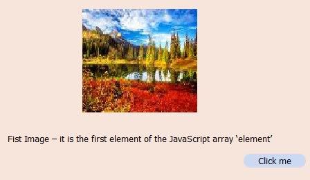
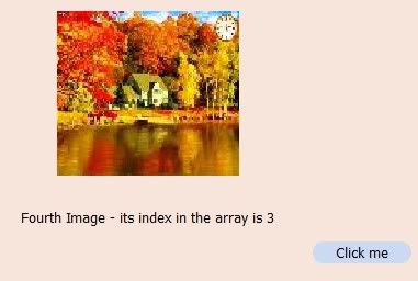
Use case: We want to implement an advertising banner composed from images and texts. We have several images combined with explanatory texts and these pairs are displayed cyclically. Additionally a button is needed to be bound to each displayed pair – for example to get more information on advertised topic. Have a look at some screenshots.
Objectives: To demonstrate how a loader and an inline component could be used together. Moreover nested components and QML Timer element are highlighted.
Design: Below you have a diagram illustrating what and how QML elements are employed.
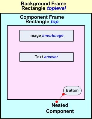
Development: The cycling is implemented through a QML Timer element. Each time the Timer generates an onTriggered signal, the sourceComponent property of the Loader (id:test) is changed to load the next pair image-text. Images are arranged in a JavaScript array – defined in JavaScript function act(). The texts are placed in the JavaScript array externalArray – defined in a separate file arrayExt.js – just to show how this approach works. The pairs image-text are modeled with a inline component – id:varText – which is loaded sequentially by the loader. The necessary button is implemented as an external component – file Button.qml – and which is nested in the component varText. The handler, connected to this button, is illustrated with console.log() function output.
Code: Each cycle forms a state. The states are indentified via the property loop, which gets int values and is used as arrays current index.
bannerComponent.qml
import QtQuick 1.0
import "arrayExt.js" as FileExt

Rectangle {
  id: topLevel
  function act() {
    var element = ["fall1.jpg", "fall2.jpg", "fall3.jpg", "fall4.jpg"];
    currentImage = element[loop];
    currentText = FileExt.externalArray[loop];
    test.sourceComponent = varText;
    if( loop == 3) {
      loop = 0;
    } else {
      loop = loop + 1;
    }
  }

  Loader {
    id: test
    anchors.centerIn: parent
  }

  property string currentImage
  property string currentText: " "
  property int loop: 0

  width: 500
  height: 300
  color: "#f7e5db"
  gradient: Gradient {
    GradientStop {
      position: 0.00
      color: "#ecd3d3"
    }

    GradientStop {
      position: 0.71
      color: "#d2e8e8"
    }
  }

  Component {
    id: varText

    Rectangle {
      id: top
      color: topLevel.color
      width: 500
      height: 300

      Image {
        id: innerImage
        anchors.top: parent.top
        anchors.topMargin: 30
        anchors.horizontalCenter: parent.horizontalCenter
        width: parent.width / 3
        height: parent.height / 2
        source: currentImage
      }

      Text {
        id: answer
        anchors.top: innerImage.bottom
        anchors.topMargin: 30
        horizontalAlignment: Text.AlignHCenter
        width: parent.width
        text: currentText
      }

      Button {
        id: bottom
        anchors.top: answer.bottom
        anchors.topMargin: 30
        anchors.right: top.right
        anchors.rightMargin: 10

        MouseArea {
          id: place
          anchors.fill: parent
          onClicked: {
            console.log("State index = ", loop)
          }
        }
      }
    }
  }

  Timer {
    interval: 3000
    running: true
    repeat: true

    onTriggered: {
      act()
    }
  }
}
Button.qml
import QtQuick 1.0

Rectangle {
  width: 90
  height: 20
  color: "#cbd9f3"
  radius: 10

  Text {
    width: parent.width
    height: parent.height
    horizontalAlignment: Text.AlignHCenter
    verticalAlignment: Text.AlignVCenter
    text: "Click me"
    font.pointSize: 8
  }
}
arrayExt.js
/* This external JavaScript file contains the text blocks */
var externalArray = [
  "First Image – it is the first element of the JavaScript array ‘element’",
  "Second Image – its index in the array is 1",
  "Third Image - its index in the array is 2",
  "Fourth Image - its index in the array is 3"
];
Download Package: Necessary files: bannerComponent.qml, Button.qml, arrayExt.js, fall1.jpg, fall2.jpg, fall3.jpg, fall4.jpg. Get them from here.
Note: The download package is organized in subdirectories corresponding to respective sections:
- Component Element Definition - Component
- Loader Element Definition – Loader
- Component Element vs. Loader Element – ComponentvsLoader
- Simple Wizard Template - SimpleWizard
- More Complex Navigation - ComplexNavigation
- Loader and Component Together - LoaderandComponent
- Loader and Inline Component - LoaderInline