Utilizing-Qt-Quick-Colibri-in-PySide
This PySide tutorial takes an existing PySide QML application that uses a totally custom UI, and shows how such an UI can be transformed to use a pre-made component library. In the future, it will be useful to use Qt Quick Components, but as it's not ready yet, we are using the open source Qt Quick Colibri library. The existing application that we are modifying for this is the WorkingOnIt.py app from the Updating QML content from Python threads tutorial.
Instructions
You need to follow the Updating QML content from Python threads tutorial up to the point where you create the QML file. As our Python code does not know anything about the QML internals (it just provides properties and slots for the QML UI to hook into), we do not need to touch the Python code at all (apart from maybe changing the filename of the QML file to load in setSource).
Getting the Colibri library
You can download the Colibri library from its Nokia Developer project page
Place the folder "colibri" from the sources into the same folder where your WorkingOnIt.py and WorkingOnIt.qml files are.
Referencing the library in the QML file
This is pretty straightforward. Add below the "import Qt 4.7" line the following statement:
import "colibri"
Reading up on the Colibri documentation
Colibri provides several useful components to work with. In this example, we are using the following components:
Using the components in our QML file
Instead of having the custom progress bar rectangle, we use CLProgressBar there. It has a "value" property that accepts a value from 0 to 100. Our backend gives us the progress from 0 to 1 as a float, so we simply multiply it by 100 in our UI code.
Instead of the custom button, we use CLButton. We can take over the "text" property from the old file, and the "onClicked" handler that starts the download can also be copied verbatim from the old example.
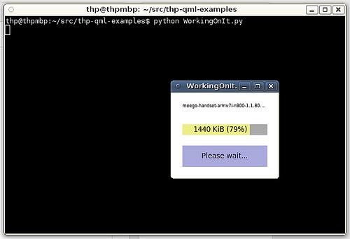
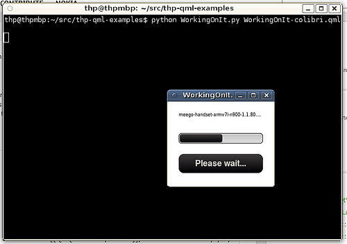
As you can see, this allows for a very short QML file that still looks better than the original, custom UI. You can also replace components part for part, and you can combine widgets from different component libraries.
Without Qt Quick Colibri
With Qt Quick Colibri
The updated QML file, utilizing Colibri
import Qt 4.7
import "colibri"

Rectangle {
 width: 200; height: 160

Text {
 x: progressBar.x; y: 20
 width: progressBar.width
 font.pixelSize: 8
 text: downloader.filename
 elide: Text.ElideRight
 }

CLProgressBar {
 id: progressBar
 x: 20; y: 60
 width: parent.width-40

value: downloader.progress*100
 }

CLButton {
 anchors.left: progressBar.left
 anchors.right: progressBar.right

y: progressBar.y + progressBar.height + 20

text: downloader.running?"Please wait…":"Start download"
 onClicked: { downloader.start_download() }
 }
}

